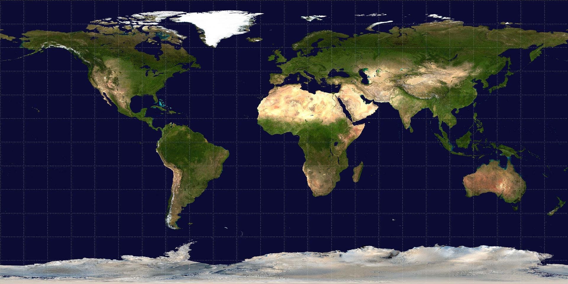
A Map Is More Than a Picture.
We often describe a map by the form in which we last encountered it.
It is an image in a report, a PDF attached to an email, a printed sheet on a wall, a collection of layers in a GIS project, or an interactive page opened in a browser. When the work is finished, we ask whether the map can be exported, embedded, downloaded, or converted into a more familiar format.
These are practical questions. They also hide an assumption: that the map is fully contained in whichever output we choose.
Sometimes it is. A carefully composed static map may be complete as an image because it was designed to communicate one view, at one scale, to one audience. Its title, legend, labels, annotations, and visual hierarchy all belong to that fixed composition.
But a digital map may contain a different kind of expression.
Its appearance can change with scale. A place can reveal more information when selected. A relationship can become visible only after the reader asks a question. A map can guide attention, expose context, respond to the reader, and present different parts of its meaning at different moments.
Export that map as an image and the result may still be useful. It is simply no longer the whole map.
The deeper point is straightforward:
A map is a map.
It should not have to pretend to be an image, a document, a database table, or a digital imitation of a printed drawing in order to be treated as a complete medium.
Every Medium Has a Native Form
A video can be represented by a still image, but the still image is not the video.
It may be a useful thumbnail. It may capture the most important frame. It may even communicate enough for a particular purpose. What it cannot preserve is duration, sequence, sound, pacing, transition, or the relationship between one moment and the next.
A video game can be recorded as a video, but the recording is not the game. It preserves one path through the experience while losing the rules, choices, reactions, and possibilities that made the experience interactive.
Music can be visualized as a waveform. A website can be printed as a PDF. A three-dimensional model can be captured as a screenshot. In each case, the conversion may be valuable, but it produces a representation of the original medium rather than an equivalent form of it.
Maps deserve the same distinction.
A map is not merely the visible arrangement of symbols at one instant. It can also contain a way of moving through scale, a hierarchy of information, rules for what appears under which conditions, relationships between places, explanations attached to features, and opportunities for the reader to ask questions of the geography.
Reducing such a map to a static image is not necessarily a failure. It is a projection: a useful view of a richer object.
The problem begins when the projection is mistaken for the object itself.
A Digital Map Is Not Just a Digitized Drawing
Much of digital cartography still inherits the conceptual model of the printed map.
There is a canvas. Geographic features are drawn onto it. Labels are placed. A legend explains the symbols. The result is exported at a chosen size.
This model remains powerful because many maps are compositions. Their meaning depends on deliberate placement, hierarchy, balance, and restraint. Digital tools did not make those concerns obsolete.
Yet a digital map can do things that have no direct equivalent on paper.
A road may become more prominent as the reader zooms in. A national boundary may matter at one scale and disappear at another. A broad pattern may be visible first, while exact values remain available when the reader asks for them. A place can carry photographs, notes, explanations, or links to related material. The reader may search, filter, compare, or move from one location to another through a relationship that the map helps reveal.
These behaviours are not decorations added after the “real” map has been drawn. They can be part of the cartographic expression itself.
Consider a map of access to healthcare.
At a regional scale, it may show broad differences in travel time. At a local scale, it may reveal individual facilities and the roads that connect them. Selecting a neighbourhood might show its population, nearest facilities, estimated travel time, and the assumptions behind that estimate. Choosing another transport mode may reshape the area that can be reached. A search can bring the reader to their own community. Additional context can explain that an apparently well-served area depends on a facility that is seasonal, private, or difficult to access in practice.
The map is not only the coloured surface visible at the beginning. Its meaning is distributed across scale, interaction, context, and response.
A labelled screenshot can preserve one statement made by that map. It cannot preserve the whole language in which the statement was made.
Hence, Images capture appearance; Maps capture relationships; and GIS captures meaning...
A Map Can Reveal Relationships, Not Just Locations
Maps are often treated as containers for things that already exist: roads, buildings, boundaries, rivers, points, and regions.
But some of the most important geographic ideas are relationships.
A school is related to the communities that can reach it. A clinic is related to the population it serves. A river is related to the land that drains into it. A market is related to the producers, roads, and settlements that sustain it. Two distant places may share a climate, a culture, an exposure to risk, or a similar level of accessibility.
These relationships are not always visible as permanent objects on the map. They may emerge only after the reader selects a place, changes a condition, or asks a question.
This is where the idea of a geographic bubble becomes useful.
A geographic bubble is an area, or a group of places, connected by a spatially meaningful condition. It might be a band of similar elevation, an area reachable within a given time, a service region, a cultural space, a heat zone, or a set of places exposed to the same risk.
A map may allow the reader to begin with one place and discover the bubble around it. It may reveal that the bubble changes with transport mode, season, threshold, or source data. It may also show that several bubbles overlap and that a place can belong to many of them at once.
That path through the geography can be part of the map’s meaning.
A static export can capture one bubble under one set of conditions. It cannot always preserve the reader’s ability to explore how the relationship changes or why the places belong together.
The Map Includes Rules, Not Only Results
When we export a table, we usually distinguish between its values and the formulas that produced them.
Two spreadsheets may display the same number while representing very different models. One contains a manually entered value. The other contains a formula that will respond when its inputs change. A screenshot of either spreadsheet captures the visible result but not the distinction.
Maps have a similar relationship between visible output and underlying rules.
A colour may be a fixed choice, or it may respond to a property of the place being shown. A layer may belong only at certain scales. A label may appear only when there is enough room or when the feature becomes relevant. A place may reveal different context depending on what the reader selects. The initial view may establish the subject of the map, while the permitted extent may keep the reader inside the geography that matters.
These decisions form part of the map even when they are not all visible at once.
This is one reason generic export formats inevitably lose something. A format designed to store geometry and attributes may not know how to represent an interaction. A style format may preserve visual rules but not the explanation, audience, or relationships surrounding the map. An image preserves appearance but not behaviour. A document may preserve the argument but not the responsive geographic experience.
The lesson is not that standards are inadequate or that maps should become impossible to move between systems. Standards are essential for exchanging data, styles, images, and published services.
The lesson is that no single generic format should be assumed to contain every aspect of a map’s identity.
Interoperability works best when we are honest about which part of the map is being exchanged.
A Map Also Has Context and Intent
A technically complete representation can still fail to communicate what a map is for.
The same Sources and layers can support several different maps. One may help an analyst inspect anomalies. Another may explain a policy decision to the public. A third may help an operations team decide where to intervene. Their geographic content may overlap, yet their intended questions, visual priorities, explanations, and acceptable uncertainties differ.
The identity of a map therefore includes more than its data.
It includes the question it raises or answers, the audience it addresses, the perspective it chooses, and the sequence in which it reveals information. It includes what the cartographer decided to emphasize and what was deliberately left quiet. It may include caveats, source relationships, update dates, and the limits within which its conclusions remain valid.
This is why treating a map as a disposable export can be so costly.
Once the output is detached from its context, the reader may still see the colours and symbols while losing the reasoning that made them meaningful. A copied image can circulate without its caveats. A downloaded dataset can lose the classification and narrative that accompanied it. An interactive map can be embedded without the article, Sources, or explanations that help the reader understand why it exists.
A map that has its own identity can retain those relationships.
It can be named, described, shared, discussed, connected to its Sources, and presented to an audience as a coherent piece of work. It can remain recognizably the same map while appearing in different contexts or being rendered through different technologies.
This does not make the map independent of its data, renderer, or platform. It means those components participate in the map without individually defining the whole of it.
Consumption Is Part of Cartography
Maps are made to be consumed.
That statement may sound obvious, but GIS workflows often devote most of their structure to producing geographic results and comparatively little to the experience through which another person encounters them.
A technically correct layer is not yet a successful communication. Neither is a valid analysis, a complete style, or a carefully prepared dataset. The map succeeds when its intended audience can perceive the relevant pattern, understand the necessary context, investigate the details, and leave with a more accurate model of the place or problem.
That may require a static composition. It may require interaction. It may require both.
The important question is not whether every map should have popups, animation, filters, or responsive styling. Adding interaction without purpose can make a map harder to understand. A fixed map can be more expressive than an interactive one when the cartographer needs to make a precise argument.
The question is whether the chosen form allows the map to express what it needs to express.
For some maps, a high-resolution image is the natural final form. For others, freezing the map into one frame removes the very qualities that allow the reader to understand it.
Cartography should be able to choose between those forms without assuming that the most portable one is automatically the most complete.
Geobble’s Attempt to Preserve Map Identity
In Geobble, a Map is not treated as the final image produced by a workflow.
It remains connected to its Sources, its cartographic choices, the context presented to the reader, and the ways that reader can explore the geography. The visible result matters, but so do the decisions and relationships that make that result meaningful.
Some of those qualities can be preserved in an image, a document, a data export, or another standard format. Others cannot.
Rather than limiting a Map to what every export format can express, Geobble attempts to preserve the richer original and treat exports as useful representations of it.
A static image may preserve the chosen view, visible layers, labels, legend, and styling. A data export may preserve geometries and properties. Another format may preserve part of the visual logic. Each can be useful without being identical to the Map from which it came.
The aim is not to make maps impossible to share outside Geobble.
It is to avoid defining the Map by the smallest format into which it can be converted.
A Map Should Be Allowed to Stay a Map
The history of cartography is full of constraints.
Maps have been shaped by paper size, printing techniques, available pigments, screen resolution, network bandwidth, storage formats, rendering engines, and the practical need to exchange work between tools. Constraints are not the enemy of expression; they often produce better design.
But a constraint should not become an ontology.
The fact that a map can be exported as an image does not mean that it is fundamentally an image. The fact that it is built from layers does not mean that it is merely a collection of layers. The fact that it can be encoded in a style does not mean that styling exhausts its meaning.
A map can be a composition, an interface, an argument, an instrument for exploration, or several of these at once.
It can tell a story without behaving like a video. It can invite investigation without behaving like a game. It can present evidence without becoming a spreadsheet. It has its own way of joining place, scale, data, symbol, context, and human attention.
That way of communicating deserves a native form.
The next time we create a map, perhaps the first question should not be, “Which format will we export it to?”
A better question is, “What does this map need to be in order to communicate faithfully?”
Geobble is our attempt to give that answer somewhere to remain intact.